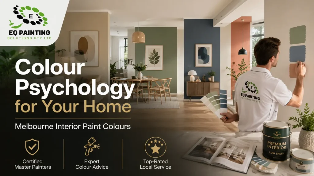
A client in Hawthorn once asked us to repaint her home office three times in six months — not because the paint failed, but because the colour never felt right for the work she was doing there. That’s colour psychology in practice: the wrong hue doesn’t just look off, it works against how a room is meant to function. Colour psychology for your home isn’t about design trends or personality quizzes — it’s the practical link between what’s on your walls and how a space actually feels to use, day after day. After 15 years painting homes across Melbourne, from weatherboard bungalows in Essendon to rendered terraces in Fitzroy, we’ve seen how much a colour choice changes a room’s mood, independent of furniture or lighting. This guide breaks colour psychology down room by room — bedroom, living space, dining area and home office — so you can choose with confidence before you book a professional repaint, not after.
What Colour Psychology Actually Means on a Real Paint Job
Colour psychology is the practical study of how colour affects mood, focus and behaviour in a space — not abstract theory, but something you can plan around before choosing a single tin of paint. At the simplest level, warm colours (reds, oranges, yellows) read as energising and sociable, while cool colours (blues, greens, soft purples) read as calming and settled. Neutrals sit in between and do a lot of the quiet work, letting a room feel larger or more grounded depending on the undertone.
What most guides skip is finish and light. A colour that reads calm in a north-facing Toorak living room with afternoon sun pouring in can feel completely different in a south-facing Brunswick terrace with flat, even light most of the day. Melbourne’s light changes a lot street to street, so the “right” mood colour is never just the swatch — it’s the swatch in your room, at the time of day you actually use it.
Bedrooms — Colours That Actually Help You Sleep
What colours promote a good night’s sleep in a bedroom? Muted blues, soft sage greens and warm neutrals consistently work best, because they’re low-stimulation colours that don’t compete with the eye once the lights are dimmed. Saturated warm colours — bright reds, strong oranges — tend to keep a bedroom feeling active rather than restful, even if you personally love the colour elsewhere in the house.
Sheen matters here too. We finish most bedrooms in a low-sheen or matte product (Dulux Wash&Wear Low Sheen or a Haymes equivalent), because a flatter finish softens the colour and reduces the glare from bedside lamps and morning light. A semi-gloss in the same colour reads noticeably brighter and less restful — the paint choice and the colour choice aren’t separate decisions.
Living and Dining Areas — Warmth Without Overdoing It
Living rooms generally do better with a calmer base — warm neutrals, soft greens or dusty blues — because it’s a room people sit in for hours and don’t want to feel wound up by. Dining areas can carry more warmth: reds, terracottas and warm oranges are genuinely linked to appetite and sociability, which is part of why so many dining rooms lean into that palette rather than shying away from it.
What are the psychological effects of using warm colours in a dining area? Warm colours in a dining room tend to increase feelings of energy and appetite and encourage conversation, which is why they’re a common choice for spaces built around entertaining rather than quiet downtime.
One thing we flag on-site constantly: a warm colour that looks rich on a sample card can turn overwhelming across four full walls, especially in a smaller Melbourne dining room with limited natural light. If you’re not sure how a colour will actually read once it’s up, that’s exactly where an on-site look before quoting earns its keep — get an accurate painting quote and we’ll talk through the room’s light and function with you before anything goes on the wall.
Home Offices and Studies — Where Blue and Green Earn Their Keep
How does blue impact productivity in a home office setting? Blue is one of the more consistently studied colours for focus — it’s associated with lower stress and steadier concentration, which is why it turns up so often in home offices and studies rather than living spaces built for socialising.
Green sits close behind it for a different reason. Green reads as calming without being sedating the way some blues can be, so it works well in a study used for long, focused stretches — reading, close work, anything that needs sustained attention rather than a burst of energy.
We’ve painted enough home offices across Richmond, Hawthorn and Malvern to notice a pattern: people who go too dark in a small home office (thinking “moody equals focused”) often end up repainting within a year because the room feels closed-in under artificial light in winter. A mid-tone blue or green usually holds up better through Melbourne’s darker months than a deep navy in a room without much natural light.
Finish and Sheen Change the Effect as Much as the Colour Itself
How do different paint finishes affect the psychological impact of room colours? Matte and low-sheen finishes soften a colour and reduce glare, which reads as calmer and more settled. Satin and semi-gloss reflect more light, which makes the same colour feel brighter, sharper and more energetic — useful in a kitchen or hallway, less so in a room meant for winding down.
This is also a practical decision, not just a mood one. Bathrooms and kitchens need a wipeable, moisture-tolerant sheen regardless of the psychological effect you’re after, so in those rooms the finish is chosen for durability first and the colour is picked to work with it. We cover this trade-off in more detail in our guide to choosing matte or satin for humid Australian rooms.
Choosing an Accent Colour Without Throwing the Room Off
How do I choose accent colours for a psychologically balanced space? Pick one accent colour and let it do one job — an accent wall, a door, joinery — rather than repeating a bold colour in three places. A single strong accent against a calmer base reads as intentional; the same colour scattered across a room reads as busy and can undercut the calming effect you were going for.
Front doors are a good example of a single, high-impact accent decision homeowners get right and wrong in equal measure. If you’re weighing that specific choice, our guide to front door colours for Australian homes goes through the same warm-versus-cool logic applied to the one surface everyone sees first.
What Changes the Scope When You’re Repainting for Mood, Not Just Colour
Going from a dark existing colour to a lighter mood colour (or the reverse) almost always needs an extra coat of primer or paint that a straightforward repaint in a similar tone wouldn’t. Two coats over a stain-blocking primer is standard when jumping several shades in either direction; skipping that step is the most common reason a “simple” mood repaint ends up looking patchy once it’s dry.
Melbourne’s winter humidity also stretches recoat times beyond what the tin states — a coat that reads touch-dry in an hour during summer can need three or four hours before a second coat goes on in a cold, damp July. If you’re planning the timing of a mood-led repaint around when you actually want the room finished, that’s worth factoring in before you book the work, not after. For a full breakdown of what changes a quote room to room, our house painting cost guide for Melbourne covers it in detail.
If you’re planning a colour-led repaint, these guides go deeper on the details that affect the result:
Frequently Asked Questions
Muted blues, soft sage greens and warm neutrals promote the best sleep in a bedroom, because they're low-stimulation colours that don't compete with the eye once the lights go down. Pair the colour with a low-sheen finish for the calmest result.
Blue is linked to lower stress and steadier focus, which is why it's one of the most common choices for home offices. It tends to hold up better than darker colours in rooms with limited natural light.
Warm colours in a dining area tend to increase energy and appetite and encourage conversation, which is why reds, terracottas and warm oranges are common in spaces built for entertaining rather than quiet downtime.
Warm neutrals, soft greens and dusty blues work best for a calming living room, since they don't compete for attention the way saturated warm colours can across a large wall area.
Green reads as calming without being sedating, making it well suited to a study used for long, focused stretches like reading or close work rather than a room built for high energy.
Matte and low-sheen finishes soften a colour and reduce glare, reading as calmer. Satin and semi-gloss reflect more light, making the same colour feel brighter and more energetic.
Pick one accent colour and let it do one job — a wall, a door or joinery — rather than repeating a bold colour in several places. A single strong accent against a calm base reads as intentional rather than busy.
Two coats over a stain-blocking primer is standard when moving several shades lighter or darker than the existing colour. Skipping the primer is the most common reason a mood repaint ends up looking patchy.
Yes — painting a large sample patch and viewing it at different times of day is far more reliable than a swatch card, since Melbourne's light shifts a lot between morning and afternoon in the same room.
Colour psychology isn’t about picking a trendy shade and hoping the room feels different — it’s matching hue, sheen and finish to how you actually use that space, then getting the prep and application right so the colour reads the way it’s meant to. If you’re planning a colour-led repaint anywhere from Richmond to Brighton, Hawthorn to Essendon, get a free, no-obligation quote and we’ll help you land on colours that work for your rooms, not just your Pinterest board.
Call 0498 200 654 or request a quote through EQ Painting Solutions.